
Shuib Abdullah
Webflow Style Guide - The Basics
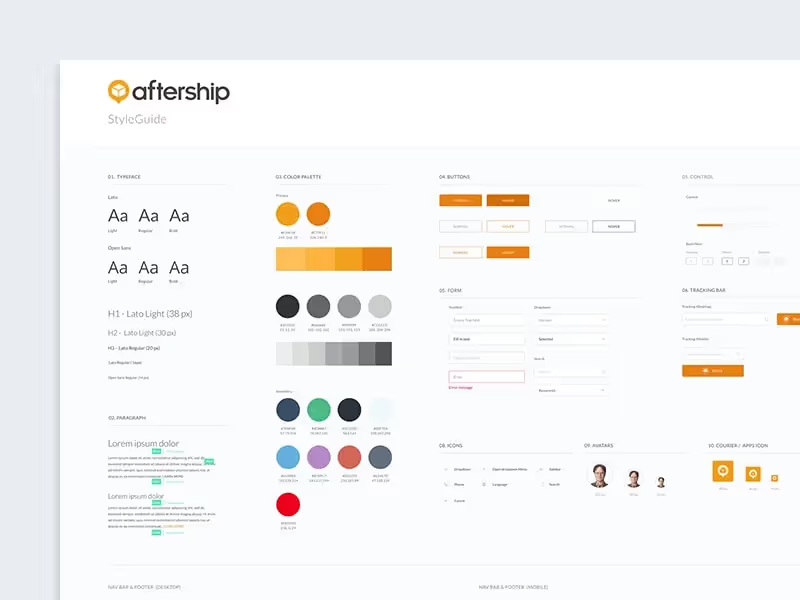
For websites that are coded, a style guide is usually done in Figma or Adobe XD, but thanks to Webflow you can create one directly with Webflow.
Usually, a style guide is broken down into components, the same way a website is. There are often different variations of these components including logos, colour palettes and fonts. This can also go further with things like font families, sizes, kerning and height/spacing.
Although this sounds fairly simple, making a style guide should not be overlooked. It requires consultation with graphic designers and marketers to ensure the website syncs with their other digital platforms. This is why I’ve included some style-guide cloneables in this article. Before Webflow, many companies relied on style guides that are PDF based, this meant it was difficult to keep up-to-date which created friction with developers. With Webflow, you’re able to create whats called a ‘living style guide’. This is essentially a visual style guide that is live and accessible on your website (sometimes password protected).
Although this sounds fairly simple, making a style guide should not be overlooked. It requires consultation with graphic designers and marketers to ensure the website syncs with its other digital platforms. This is why I’ve included some style guide cloneable in this article.Before Webflow, many companies relied on style guides that are PDF based, this meant it was difficult to keep up-to-date which created friction with developers. With Webflow, you’re able to create what's called a ‘living style guide’. This is essentially a visual style guide that is live and accessible on your website (sometimes password protected).
The first thing to consider when starting a style guide is purpose. You’ll need to analyze the operations of the company and its audience to get context. It is especially important to analyze the clients or customers who will visit the website. To truly create an effective guide, the website needs to have a top-tier user experience. This starts with good documentation that developers can follow, saving time and resources.
Colors
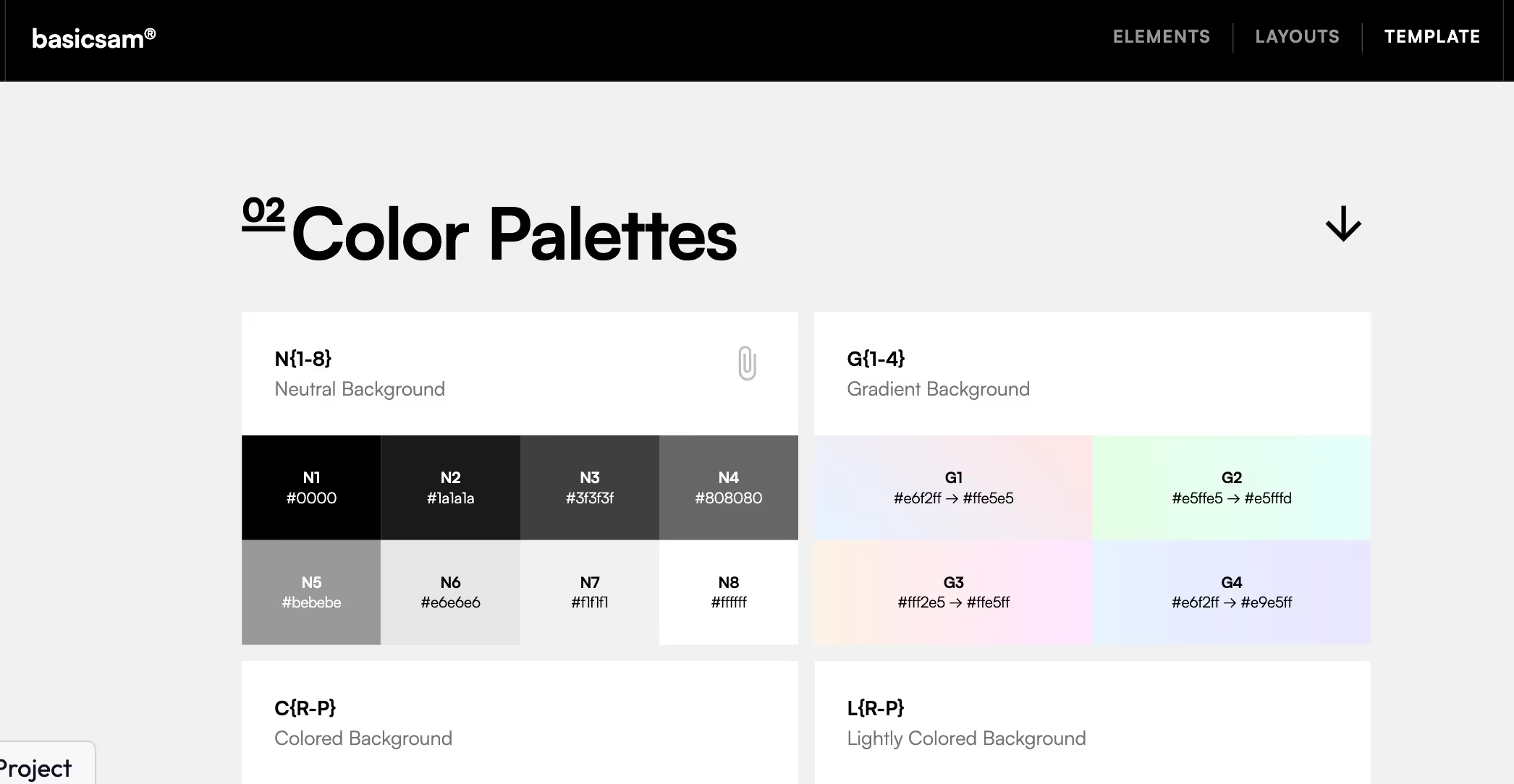
Colours are the bread and butter of any design, so this part is of most importance. You can use websites such as coolers.co to pick out various shades. Designers and developers alike typically use 3 or more variations of colours; primary, secondary and tertiary. The primary colours are the main colours that are specific to the company, while the secondary colours represent the additional colours used for highlights.
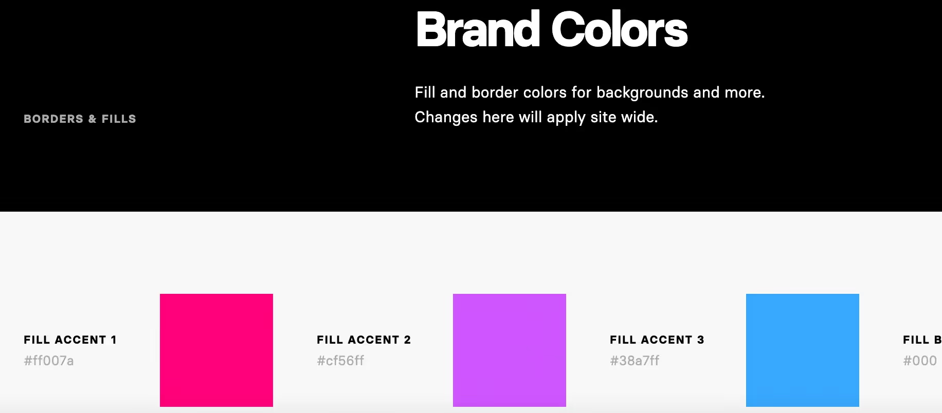
There’s a lot involved in creating the right combination of colors for your brand. You’ll need to familiarize yourself with the essential terms and learn more about Color Theory to be successful in this area.
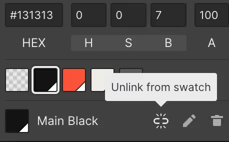
In Webflow, its straightforward to customize your colours. First, Make a box (or whatever brand-appropriate shape you want) of solid colour for each brand colour, text colour, and neutral tone you’ll use on the site. Then, make a global swatch for every colour you need.
Additionally, you’ll need to present these colours in your style guide using both their visual appearance and technical values. For example, when adding ‘purple’, you’ll also include its HEX or RGB colour code for developers.
Global swatches were introduced in 2017 and they’re a great way to:
- Updating and maintaining brand colours
- Experimenting with colour schemes during the design phase
- Tweaking brand gradients across your site
Typography
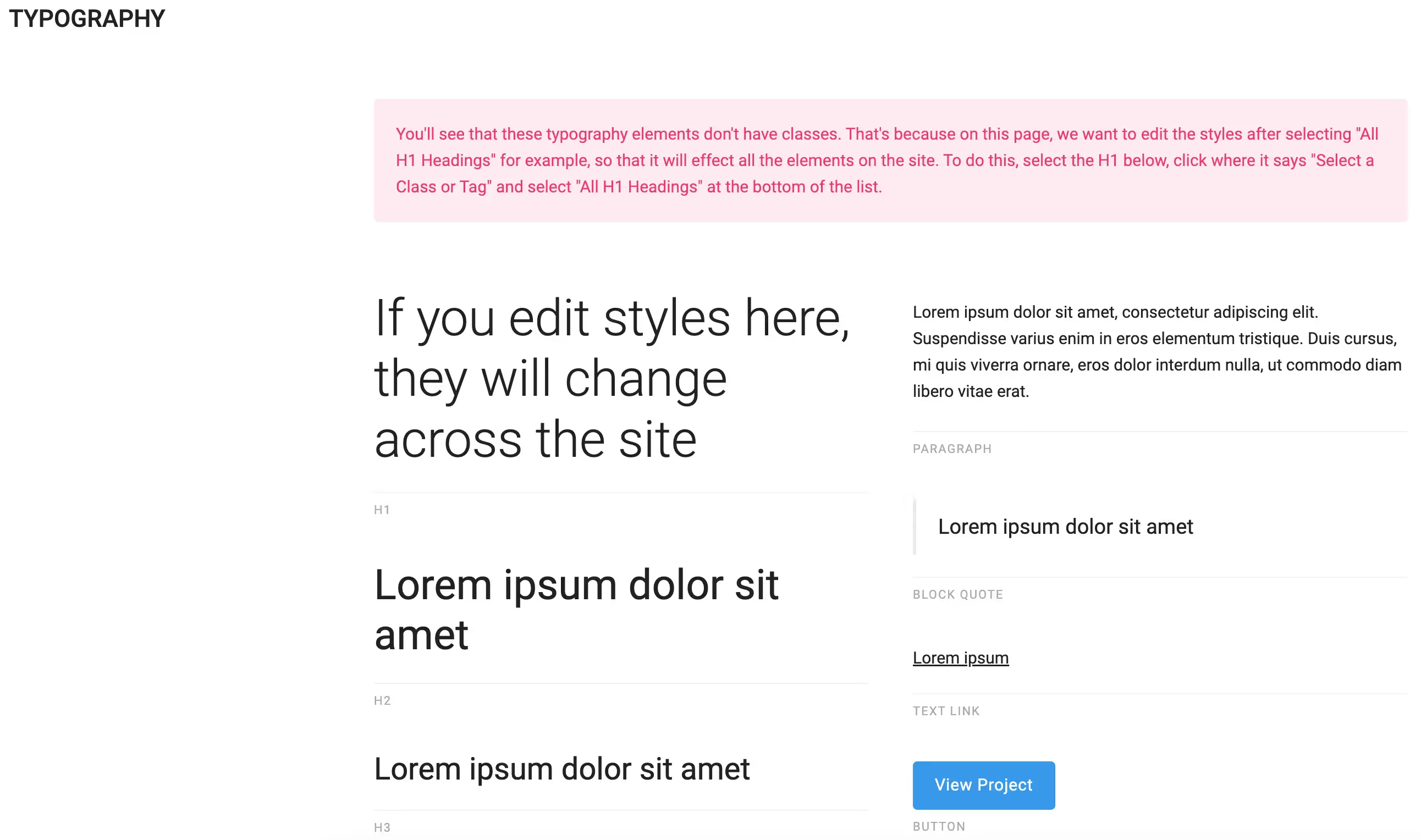
Typography is one of the biggest ways to add value to your site. The right typography and text hierarchy can make or break your site. The bulk of it is deciding which is the appropriate size to use.
It's also useful to consider the importance of line height, character spaces and the colours of body text. These factors are often forgotten about by developers. The layout of this section of the style guide is also crucial. You’ll need to label the fonts and elements appropriately, e.g. H1, H2, H3 etc.
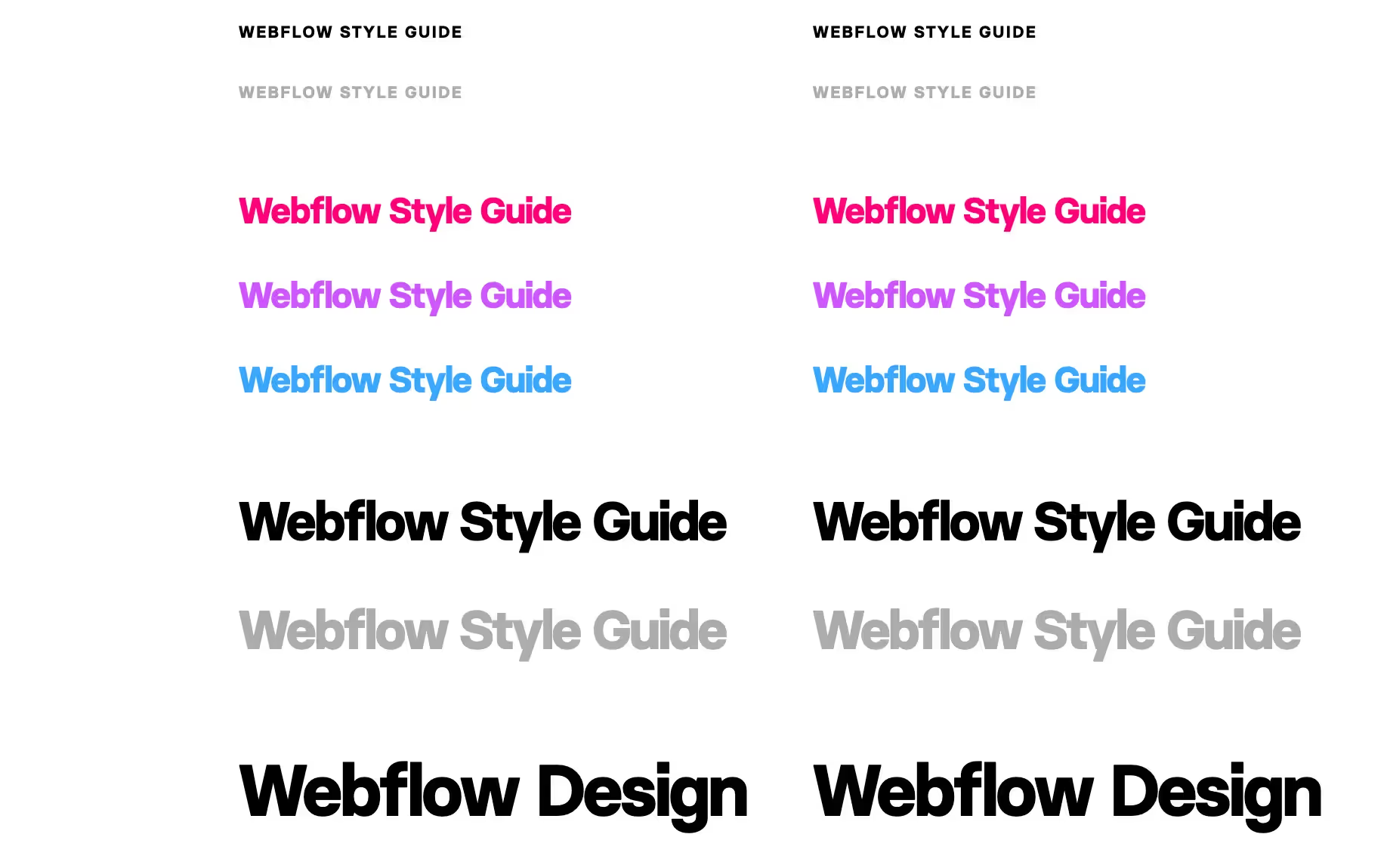
After you pick your heading, you’ll need to include a section for running (body) text as well as forms and alert messages, These styles will include font families — which are sets of fonts such as Montserrat or Open Sans.
Ideally, the sizes should be set in pixels (px) and remain consistent across the various elements. You’ll also want to keep your developers happy by using progressive sizes such as 14px, 16px, 18px, or 20px.
Here is a free clonebale Webflow style guide to get you started:
https://webflow.com/made-in-webflow/website/the-style-guide-template
Spacing and Grids
Working to position elements on a website can be tricky, especially without a good design or style guide. To make yourself and others' lives easier, it's good to have this documented.Correctly displaying images and text blocks means our site won’t break at different displays. Therefore, it is helpful to specify the spacing required between each section/element of your site.Since Webflow style guides are live pages, you can just move the elements accordingly without much labelling. This is because other website editors can use the Designer to inspect where elements are in relation to each other
Graphics and Icons
In any Website, image optimization is key. Webflow handles this well by allowing developers to use their free image CDN, reducing page speed times. For icons and graphics, it's probably best to use SVG’s so you can change their colour in Figma.
To add some uniqueness to your Webflow website and brand, it is recommended to design custom illustrations. This can give a singular appearance and add more character to your brand. You’ll want to make sure to include style and colour references for the kind of illustrations you use.
A useful website to find icons and SVGs: https://icons8.com/icons/set/custom. Here you can export SVG’s and then customize the color in Figma.
Another key area of the style guide which Webflow does well is button behaviour an animation. Have a look at the image below, the buttons are all clearly layed out and animations are incorporated. When we hover over the ‘Line button’, it behaves as it should. This allows developers to simply copy and paste the button as is and not worry about animation complexities.
To build this yourself, it is as simple as building a regular button with a hover animation. Here’s a short tutorial on how to do that: https://www.youtube.com/watch?v=t4Y4TngjOEY&ab_channel=Webflow
Sometimes the concepts in your style guide may be tricky to explain with text alone. Therefore, it is important to utilize practical examples – such as visual dos and don’ts or rules — to demonstrate the usage of the guidelines and rules defined within your live style guide.

One other area of the style guide to pay attention to is assets. Developers will need a place to download logos, icons and fonts so having an easily accessible place for this is key. In Webflow, you can store all assets in the assets panel, from there you can include documents such as PDF’s or images in various formats such as SVG’s, JPG’s and PNG’s.
There a number of style guide templates and designs you could go with. I’ve listed a few below, each with their own angles that make them unique.
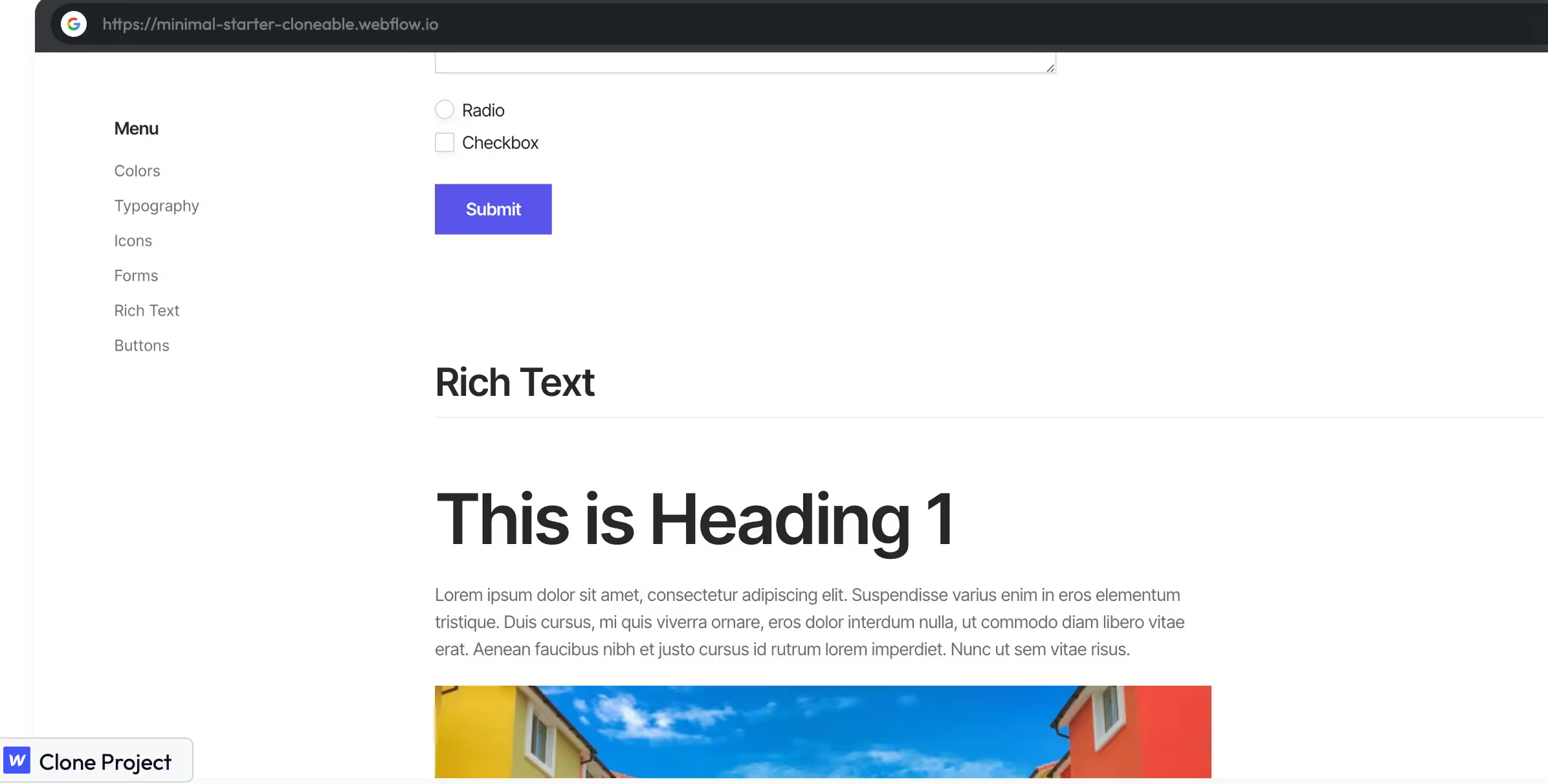
This one is a minimal style guide that offers a beginner-friendly approach to documenting your styling: https://showcased.webflow.io/projects/minimal-starter-or-style-guide-template
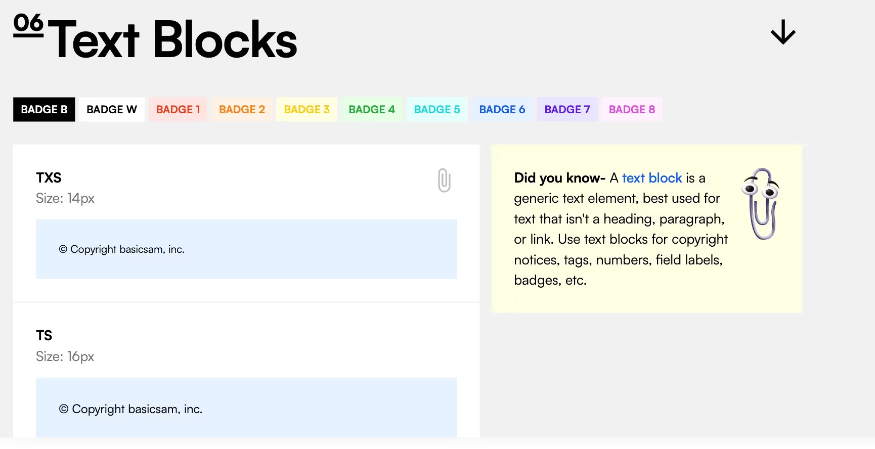
This style guide is for those looking for a more in-depth guide. Here, the designer (@basicsam) uses a vast array of colours in his palette with appropriate labels. He also added small information cards to help you create an efficient style guide for your brand or client.
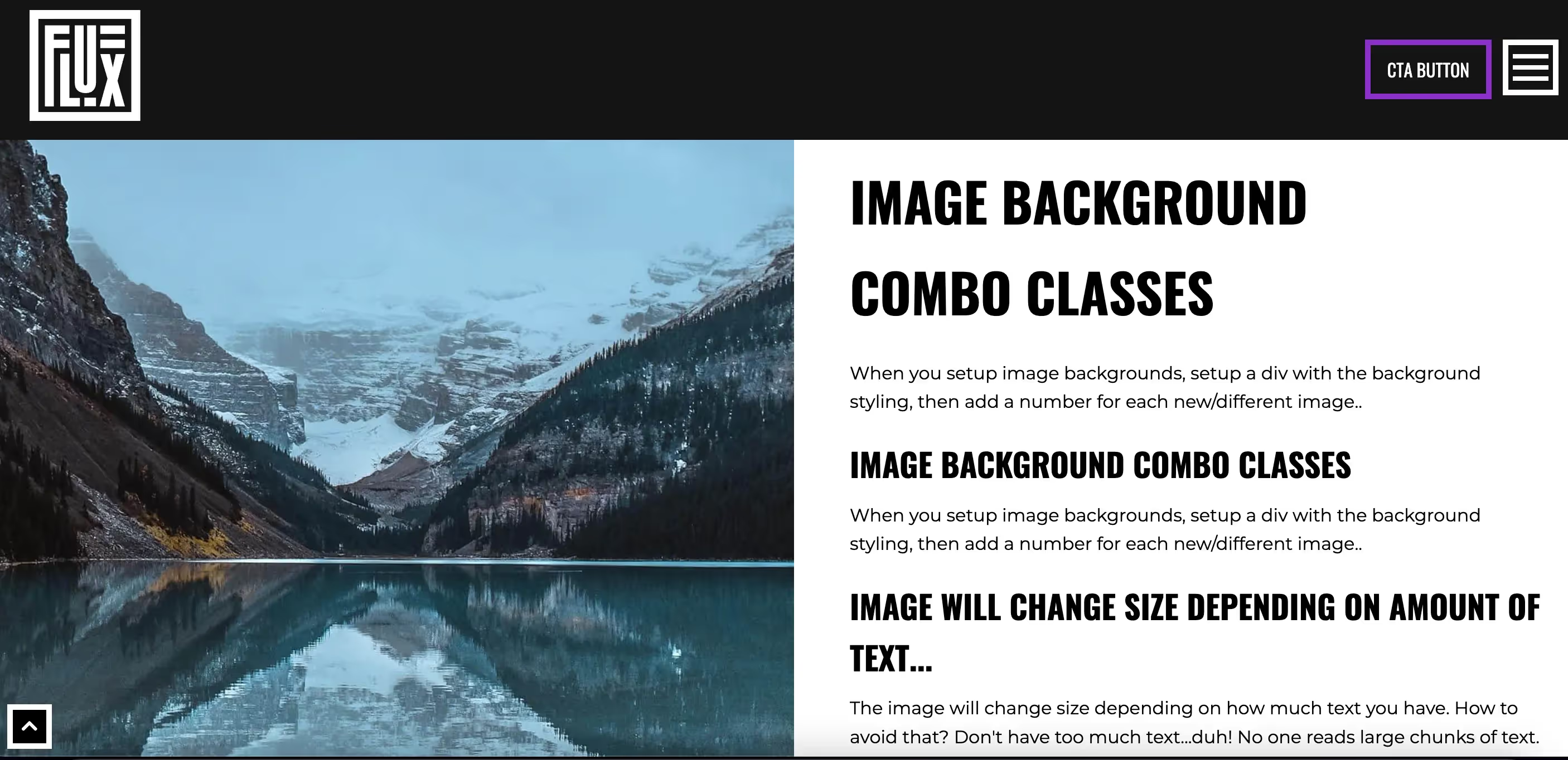
Last but not least, we have a beautiful and highly practical style guide made by Flux Academy. This guide illustrates an array of icons you can use and also how the grid system works. Personally, my favourite part of this guide is how much effort they put into showing us different layouts we could use.
.avif)
Clone it for free here: https://showcased.webflow.io/projects/flux-structure
Fügen Sie Ihrem Webflow-Projekt in wenigen Minuten Mitgliedschaften hinzu.
Über 200 kostenlose, klonbare Webflow-Komponenten. Keine Anmeldung erforderlich.
Fügen Sie Ihrem React-Projekt in wenigen Minuten Mitgliedschaften hinzu.

.webp)


.png)
