Ovidiu
How to automatically hide/show elements to mobile visitors
Other use-cases using Memberscript #120
- How to automatically hide/show elements to tablet visitors
- How to automatically hide/show elements to desktop visitors
- How to automatically hide/show elements to users on a touch screen device
- How to automatically hide/show elements to users with a device in portrait mode
- How to automatically hide/show elements to iOS visitors
- How to automatically hide/show elements to android visitors
- How to automatically hide/show elements to macOS visitors
- How to create a download in App Store button (only visible to iOS users)
- How to create a download in Play Store button (only visible to android users)
- How to create a download for macOS button (only visible to Mac users)
- How to create a download for Windows button (only visible to Windows users)
- How to create a download for Linux button (only visible to Linux users
- How to create a download Chrome Extension button (only visible to Chrome users)
- How to automatically hide/show elements to Windows visitors
- How to automatically hide/show elements to Linux visitors
- How to automatically hide/show elements to visitors using Chrome
- How to automatically hide/show elements to visitors using Edge
- How to automatically hide/show elements to visitors using Safari
- How to automatically hide/show elements to visitors using Firefox
- How to automatically hide/show elements to visitors using Opera
- How to tell your visitors to stop using Internet Explorer
Memberscripts needed
https://www.memberstack.com/scripts/device-os-browser-visibility
Tutorial
Cloneable

Why/Use Cases
- Show or hide elements on your site based on your visitors’ device, OS, or browser.
Automatically hiding/showing elements to mobile visitors on a Webflow site
Some things just don’t always make sense for certain visitors, which is why you can choose to show or hide certain elements based on what you know your visitors need or don’t need.
For example, you might want to display an App Store button on iOS devices and a Play Store button for Android devices, you might want to hide both on desktop, show a Microsoft Store link on Windows only, and so on.
This guide will help you fine-tune display conditions based on yours and your users’ needs.
To automatically hide or show elements to your mobile visitors, we’re going to use MemberScript #120 – Show/Hide Element Based On Device, OS, or Browser. Follow the link to get the code you’ll need to add to your page and watch a video tutorial on how to set everything up.
Setting it up
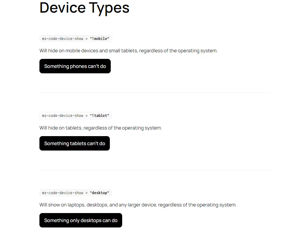
The only attribute we’re going to use for this functionality is ms-code-device-show. Add the attribute to whatever you want to apply display conditions to and depending on the use case, only the values will differ.
For example, ms-code-device-show=”mobile” will only display the element on mobile devices, while ms-code-device-show=”desktop” will only display it on desktops.
To achieve the exact opposite, simply add an exclamation point before the value, like so:
· ms-code-device-show”!mobile” – this will hide the element on mobile and display it everywhere else
Additionally, you can combine multiple conditions by using & for “and” and | (vertical line, not capital “i”) for “or,” like so:
· ms-code-device-show=”desktop&tablet” – this will only display the element on desktops and tablets
· ms-code-device-show=”windows|linux” – this will only display the element on either Windows or Linux only
For a full list of available values, see our cloneable page.
Making it work
Now that you’ve got everything set up in Webflow, all you need to do is add the MemberScript #120 custom code to your page (or sitewide), before the closing body tag.
Schlussfolgerung
That’s everything, you can now go ahead and test the show/hide functionality on your live site.
If you want to use our demo project to get you started, just click the button below to add it to your Webflow site.
Our demo can help you show or hide elements on your Webflow site based on visitors’ device, OS, or browser.
Take me to Cloneable!
Fügen Sie Ihrem Webflow-Projekt in wenigen Minuten Mitgliedschaften hinzu.
Über 200 kostenlose, klonbare Webflow-Komponenten. Keine Anmeldung erforderlich.
Fügen Sie Ihrem React-Projekt in wenigen Minuten Mitgliedschaften hinzu.

.webp)


.png)
